
티스토리 뷰
사용 예제 3에서 학습했던 image view 나 image button의 경우, 클릭 이벤트를 걸어줄 수는 있었지만 클릭해도 이미지 자체에는 아무런 변화가 없었다. 버튼이 눌렸을 때 토글된 이미지가 보이게 하려면 Drawable 객체를 사용하면 된다.
Drawable은 상태에 따라 그래픽이나 이미지가 선택적으로 보이게 할 수 있게 해준다.
Drawable은 뷰에 설정할 수 있는 객체이며, 그 위에 그래픽을 그릴 수 있다.
Drawable은 그 쓰임새에 따라서 7가지 종류로 구분할 수 있다.
| Drawable | Description |
| BitmapDrawable | 이미지 파일을 보여줄 때 사용함 |
| StateListDrawable | 상태별로 다른 비트맵 그래픽을 참조함 |
| TransitionDrawable | 두 개의 Drawable을 서로 전환할 수 있음 |
| ShapeDrawable | 색상과 그라데이션을 포함하여 도형 모양을 정의할 수 있음 |
| InsetDrawable | 지정된 거리만큼 다른 드로어블을 들어서 보여줄 수 있음 |
| ClipDrawable | Level 값을 기준으로 다른 Drawable을 클리핑할 수 있음 |
| ScaleDrawable | Level 값을 기준으로 다른 Drawable의 크기를 변경할 수 있음 |
앱을 만들 때, 가장 많이 사용되는 Drawable은 State와 Shape Drawable이다.
그럼 State Drawable Shape Drawable의 간단한 예제를 구성해보자.
▶State Drawable
우선, res/drawable 폴더에 뭉치 Drawable을 생성해준다.
◎/app/res/drawable/moongchi.xml
<?xml version="1.0" encoding="utf-8"?>
<selector xmlns:android="http://schemas.android.com/apk/res/android">
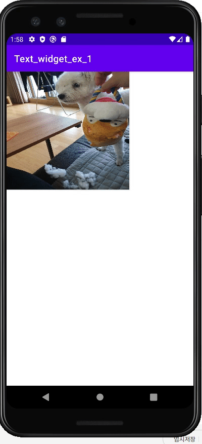
<item android:state_pressed="true" android:drawable="@drawable/img3"/>
<item android:drawable="@drawable/img2"/>
</selector>처음 drawable객체를 생성하면, selector 태그가 생성이 되는데, 그 내부에 item 객체를 사용하여 사용할 drawable을 직접 작성할 수 있다. 위 코드는 state가 pressed일 때 img3를 사용하고, 평소에는 img2를 사용한다는 뜻이다.
이제, 빈 레이아웃에 button을 하나 생성하고 해당 버튼의 배경을 방금 생성한 뭉치 drawable 로 설정하여 실행해보자.
◎main_activity.xml
<?xml version="1.0" encoding="utf-8"?>
<androidx.constraintlayout.widget.ConstraintLayout xmlns:android="http://schemas.android.com/apk/res/android"
                                                   xmlns:app="http://schemas.android.com/apk/res-auto"
                                                   xmlns:tools="http://schemas.android.com/tools"
                                                   android:layout_width="match_parent"
                                                   android:layout_height="match_parent" android:orientation="vertical">
    <android.widget.Button
            android:layout_width="258dp"
            android:layout_height="247dp" android:id="@+id/button3" tools:layout_editor_absoluteY="184dp"
            tools:layout_editor_absoluteX="68dp" android:background="@drawable/moongchi"/>

</androidx.constraintlayout.widget.ConstraintLayout>
여기서 중요한 점은 <Button> 태그 대신 <android.widget.Button> 을 사용해야 backgroud 속성에 drawable객체를 삽입할 수 있다.
안드로이드 버전이 올라가면서 그냥 버튼 태그는 Material Button으로 인식되는데, 이 Material Button은 Background 속성을 무시한다고 한다.
▶Shape Drawable
이번에는 원하는 도형을 직접 그릴 수 있는 shape drawable을 생성해보자.
마찬가지로 app/res/drawable내에 객체를 생성해주자.
◎shape_ex.xml : 버튼을 만들기 위한 Drawable
<?xml version="1.0" encoding="utf-8"?>
<shape xmlns:android="http://schemas.android.com/apk/res/android"
    android:shape="rectangle">
    <size android:width="200dp" android:height="120dp"/>
    <stroke android:width="1dp" android:color="#0000ff"/>
    <solid android:color="#aaddff"/>
    <padding android:bottom="1dp"/>
</shape>
◎shape_ex_2.xml : 배경을 만들기 위한 Drawable
<?xml version="1.0" encoding="utf-8"?>
<shape xmlns:android="http://schemas.android.com/apk/res/android">
    <gradient
        android:startColor="#7288DB"
        android:centerColor="#3250B4"
        android:endColor="#254095"
        android:angle="90"
        android:centerY="0.5"
    />
</shape>
위와 같이 <selector> 를 <shape>로 바꿔주고, 그릴 도형을 선언하여 속성을 부여하면 drawable 객체는 하나의 도형이 된다.
◎ main_activity.xml
<?xml version="1.0" encoding="utf-8"?>
<androidx.constraintlayout.widget.ConstraintLayout xmlns:android="http://schemas.android.com/apk/res/android"
                                                   xmlns:app="http://schemas.android.com/apk/res-auto"
                                                   xmlns:tools="http://schemas.android.com/tools"
                                                   android:layout_width="match_parent"
                                                   android:layout_height="match_parent" android:orientation="vertical"
                                                   android:background="@drawable/shape_ex_2">

    <android.widget.Button
            android:text="Button"
            android:layout_width="wrap_content"
            android:layout_height="wrap_content" android:id="@+id/button4"
            android:background="@drawable/shape_ex"
            app:layout_constraintTop_toTopOf="parent" app:layout_constraintBottom_toBottomOf="parent"
            app:layout_constraintEnd_toEndOf="parent" app:layout_constraintStart_toStartOf="parent"
            app:layout_constraintVertical_bias="0.823"/>

</androidx.constraintlayout.widget.ConstraintLayout>
'Mobile > Android' 카테고리의 다른 글
| [Android] Event 2:화면 전환 Event 처리 (0) | 2022.03.17 |
|---|---|
| [Android] Event 1: Event 처리 이해하기 (0) | 2022.03.16 |
| [Android] 기본 위젯 사용 예제 3: image view & image button (0) | 2022.03.14 |
| [Android] 기본 위젯 사용 예제 2: plain text (0) | 2022.03.14 |
| [Android] 기본 위젯 사용 예제 1: text view & buttons (0) | 2022.03.13 |


- Async
- redux-thunk
- react
- 인천 구월동 이탈리안 맛집
- react-native
- redux
- 이탈리안 레스토랑
- 정보보안기사 #실기 #정리
- Promise
- 인천 구월동 맛집
- javascript
- AsyncStorage
- 파니노구스토
- await
- 맛집
- Total
- Today
- Yesterday